Muted Tones
Muted Tones

The Beauty of Subtle Colors and Muted Tones
When it comes to color palettes, there is something truly captivating about subtle colors and muted tones. These understated hues bring a sense of calm, sophistication, and elegance to any space or design. Let's explore the beauty and versatility of subtle colors and muted tones.
What are Subtle Colors and Muted Tones?
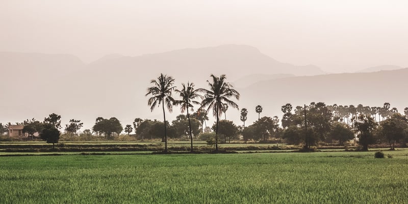
Subtle colors are soft, gentle shades that lack strong chromatic content. They are often described as pastel or washed-out colors that have a delicate and soothing appearance. Muted tones, on the other hand, are desaturated colors that have been toned down by adding black, white, or grey to the base hue. These colors have a subtle, understated quality that can create a sophisticated and timeless look.
The Allure of Subtle Colors
Subtle colors, such as soft blues, pale pinks, and muted greens, evoke a sense of tranquility and serenity. They are perfect for creating a peaceful and harmonious environment, whether in interior design, fashion, or graphic design. These colors are versatile and can be used as a base for bolder accents or as standalone shades for a minimalist aesthetic.
Exploring Muted Tones
Muted tones like dusty rose, sage green, and slate grey add a sophisticated touch to any color scheme. These colors are subtle yet impactful, creating a sense of depth and richness in a design. Muted tones work well in both modern and traditional settings, adding a sense of warmth and elegance to any space.
How to Use Subtle Colors and Muted Tones
Whether you're designing a room, creating a piece of art, or putting together an outfit, subtle colors and muted tones can elevate your design. Consider using these hues for walls, furniture, textiles, or accessories to create a cohesive and visually pleasing look. Mix and match different subtle colors and muted tones to add dimension and interest to your design.
Embracing the Subtlety
Embrace the understated beauty of subtle colors and muted tones in your next project. Whether you prefer the calming effect of soft pastels or the sophistication of desaturated hues, these subtle colors can transform any space into a peaceful sanctuary. Experiment with different combinations and see how these subtle hues can enhance your design aesthetic.
Discover the beauty and versatility of subtle colors and muted tones in your designs. Let these understated hues bring a sense of tranquility and sophistication to your creations.
Remember, sometimes less is more, and in the case of subtle colors and muted tones, a little goes a long way in creating a timeless and elegant design.
So, why not add a touch of understated beauty to your next project with subtle colors and muted tones?